
We’re turning Vertical Tabs upside down in Opera
Share


Hey all,
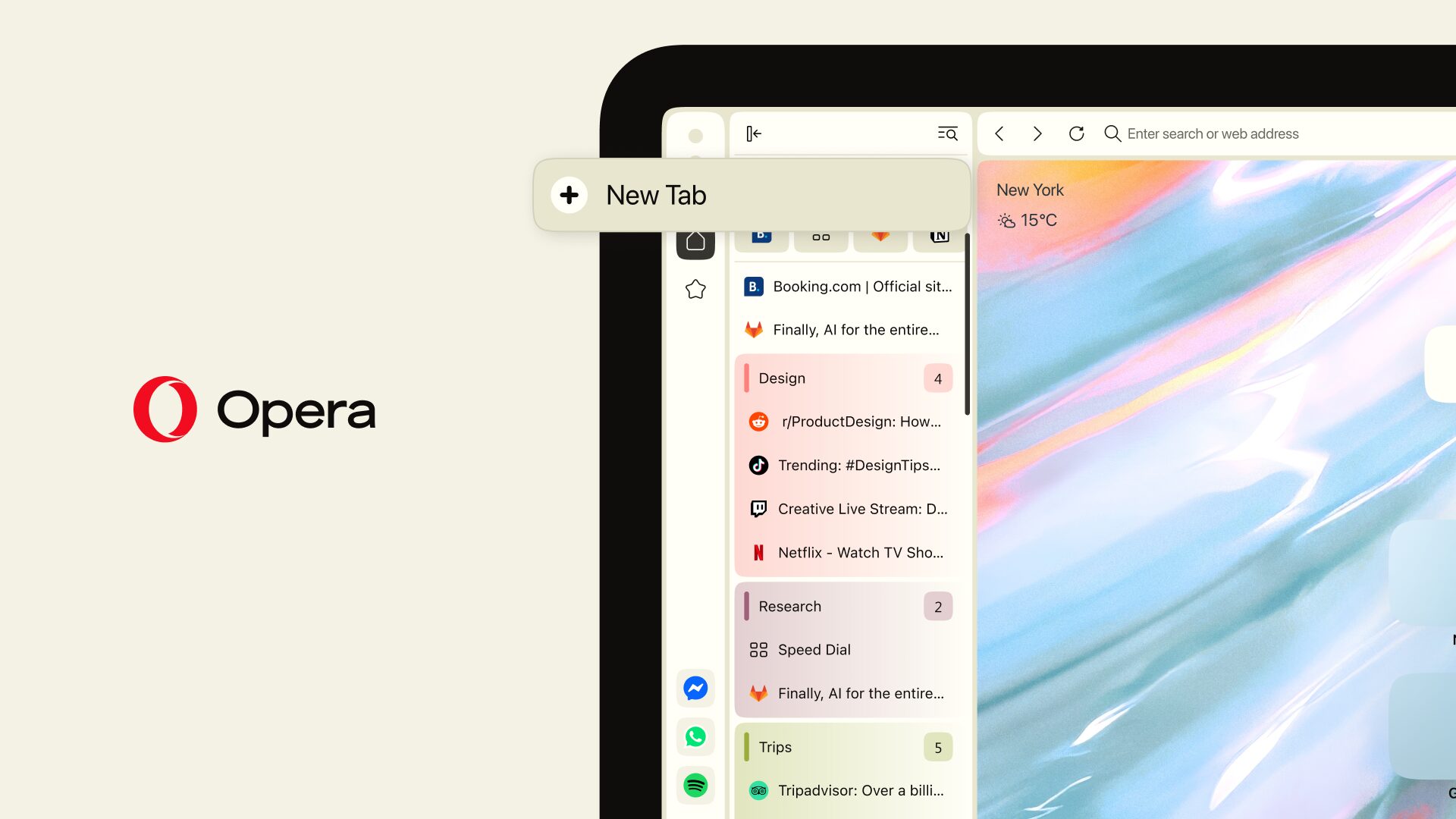
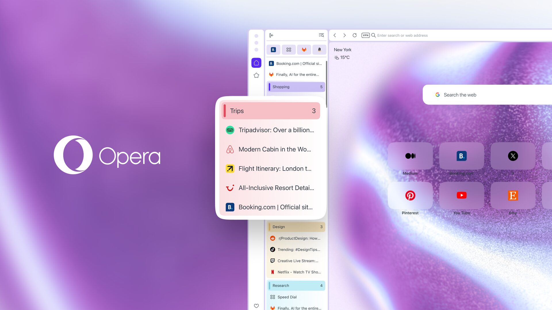
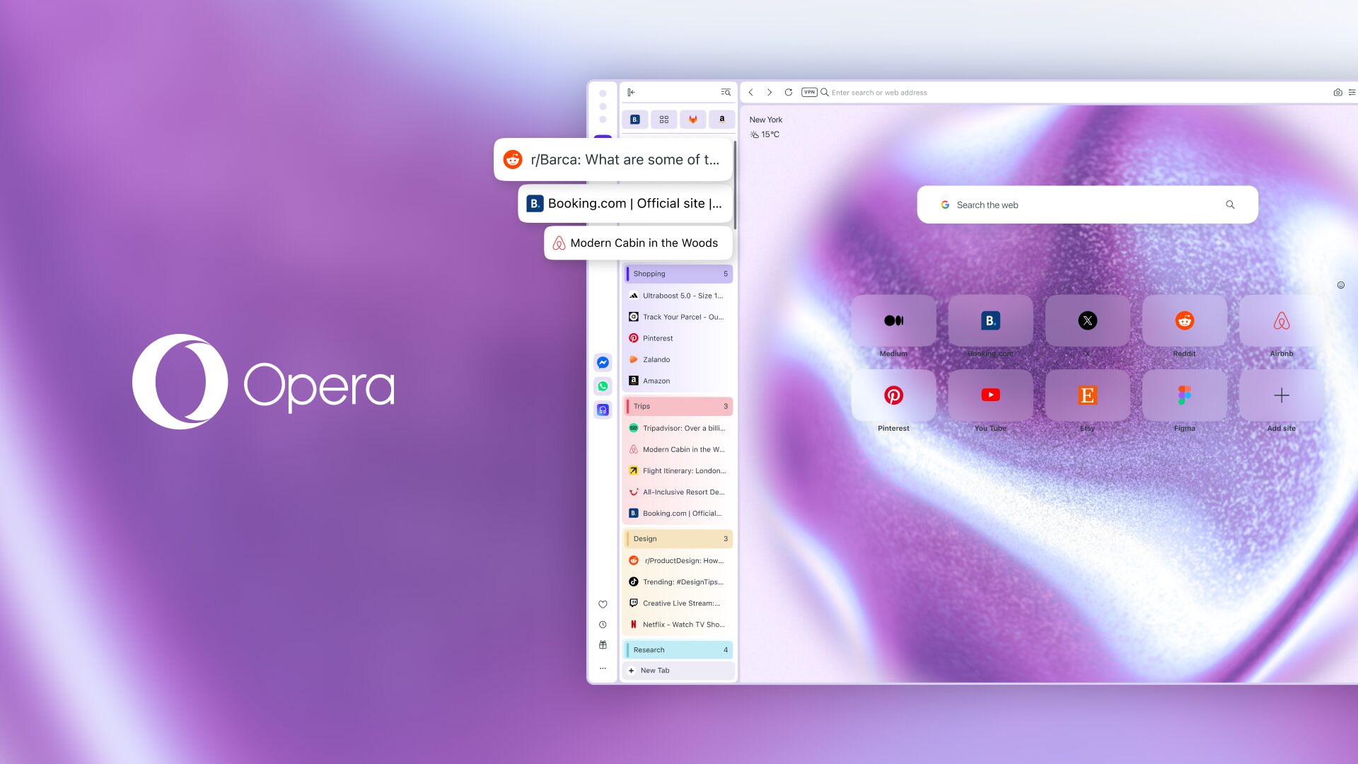
In July we introduced Vertical Tabs to Opera One, a feature long requested by you. We implemented it like other browsers so the experience would feel familiar to you when switching to Opera, but we have to admit: placing the “New Tab” button at the bottom was a mistake. We spent weeks looking at your feedback, discussing it, and testing internally to understand how we could implement Vertical Tabs in a better way, our way. In the end, it turns out we just had to turn everything upside down, literally.
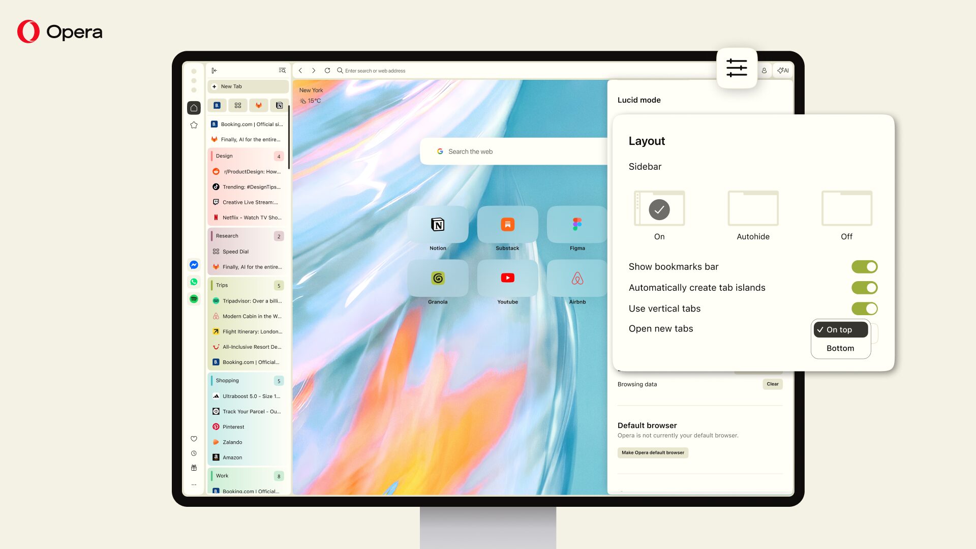
So, from today we’re switching the default position of the “New Tab” button from the bottom of the tab strip and placing it at the top. Additionally, we’re changing the order in which new tabs appear in the vertical tab strip: newer tabs now appear at the top. In this blog we’d like to walk you through our train of thought regarding these changes. And just in case, you’ll be able to choose to revert to the old system at all times so it remains your choice.
Why we changed our minds about Vertical Tabs
We implemented the vertical tab strip the way other browsers do, and it was the wrong call. You told us so by leaving feedback in forums, articles, and directly through our channels.
The bottom line from all of it was the same: the “New Tab” button at the bottom of the vertical tab strip sits too far from everything else. It’s worth seeing how far that actually is.
When you’re using the horizontal tab layout, the “New Tab” button sits only a few pixels from the address bar. But in the vertical layout it moves to the bottom of the strip, and once you open enough tabs to fill it, the button stays fixed at the bottom of the window while everything else stays at the top. On a 1080p display that’s roughly 950 pixels below the address bar, at 2560×1440 it’s about 1,300, and on a native 4K display without scaling it’s over 2,000.
So every time you open a tab, you move the cursor down the window and back up to the address bar. We ran a survey* among you, and over 73% said you open new tabs by clicking the button rather than using a shortcut. Which makes that round trip the norm rather than the exception.
The order in which new tabs appear also follows that logic. If the “New Tab” button is at the top, then the tab it creates should appear directly beneath it rather than at the opposite end of the strip. Tab Islands are the exception: inverting those would mean the whole Tab Island expands upwards, which is a much bigger change to how they behave, and we didn’t think it was warranted here.
Is familiar design worth keeping?
We thought long and hard about this, and we understand that there’s a tension between respecting your browsing habits and muscle memory and developing a better experience. That’s exactly why you can switch back to the old system if you’re too used to it; you can do so in the Easy Setup menu.
But let us ask you: is an inefficient design really worth keeping just because we’re used to it?
The answer isn’t a straight yes or no. There is plenty of imperfect design that isn’t worth disrupting, and the cost of relearning something you do often is real. That’s called path dependency: past decisions constraining future ones long after the reason for them is gone.
We think our case is different because Vertical Tabs has been in Opera for less than two months and the habits you’ve built with it are recent ones. If we were going to change this, it was better to do it now instead of waiting for years.
Additional quality of life changes that we’re adding
We’ve also gone through other aspects of the vertical tab strip and introduced some changes. They’re meant to make the experience more consistent with the traditional horizontal tabs, making it easier for you to switch between modes.
First, the current active tab is much easier to spot now. We made the contrast of the currently active tab higher so it doesn’t fade into the background color – this is more noticeable when you’re using Tab Islands.
Second, we added a new way of adding a tab to a Tab Island: when you hover over it you can see a new “+” icon at the bottom which you can use to add new tabs to it.
Third, we fixed an issue that you pointed out repeatedly in the survey we ran: closing tabs when using collapsed mode. Now it’s easier to close them, but it also keeps you from closing them accidentally.
Finally, now you can drag and drop a tab into another to create a new Tab Island – this should make it easier to create them manually.
Try the new Vertical Tabs in Opera and tell us what you think
Download Opera One here to try out the new Vertical Tabs and let us know: do you prefer the “New tab” button at the top of the strip or at the bottom?
One last thing: thank you for the feedback. The collapsed-mode fix in this update came straight from the survey, and the whole thing exists because you told us the first version was wrong. Keep doing that.
For more details about this update you can read more here.
*Survey of Vertical Tabs users: n=4900 users surveyed in August/September 2026 among Opera One desktop users with Vertical Tabs enabled.

User comments
You deserve abetter browser
Faster, safer and smarter than default browsers. Fully-featured for privacy, security, and so much more.




You deserve a better browser
Opera's free VPN, Ad blocker, and Flow file sharing. Just a few of the must-have features built into Opera for faster, smoother and distraction-free browsing designed to improve your online experience.