The new “O” has landed on Opera for computers
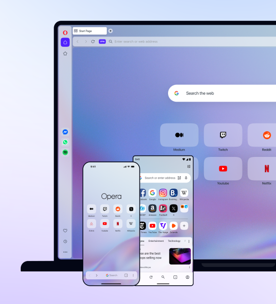
We’ve released Opera 33 for computers today. Along with the features and bug fixes that we talk about regularly on the Desktop team blog, today’s release also sports a new product logo that reflects our new brand identity.
You will find the updated “O” icon in our menu button, on the taskbar, and of course on your desktop screen.
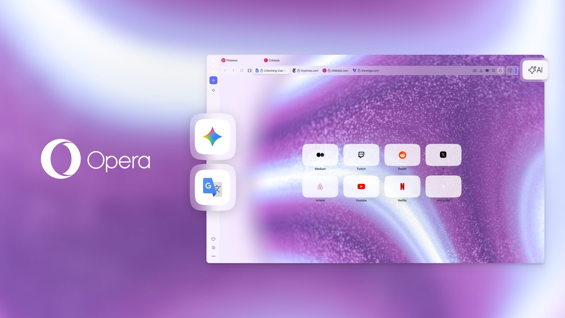
Last month, we launched Opera’s new brand identity, which is more than just a logo change. The new 3D “O” symbolizes a gateway that helps you do more online.
We’re gradually rolling out new product icons to our mobile browsers and apps. Currently, you’ll see the new “O” in Opera for computers, Opera Mini for iOS, and Opera Mini for Windows Phone.
An icon for each stage of development
Your real-time feedback and bug reports help us a lot, since we have a pretty fast release cycle: Every six weeks, we publish a new version of Opera in our experimental developer channel, waiting for you. Within a few weeks, a more stable, beta version follows. Then, a few weeks later, we iron out all the kinks and release the stable version.
With the new, 3D icon, we can reflect this development process. The developer channel builds show a wireframe icon, just black, white and grey. The beta icon depicts some more finished work, and the wireframe starts getting painted up with our signature red.
Improvements on Mac and Linux
With Opera 33, we’ve cleaned up the look of Opera on Mac. We gave it a shiny new “vibrant” toolbar to match the rest of El Capitan’s transparent look. And, we’ve added support for proprietary codecs like H264 video and MP3 audio on Linux.
Let us know your thoughts. You can comment on this blog, or ping us on Twitter.


