Opera Developer 49 introduces new, easy configuration

Welcome,
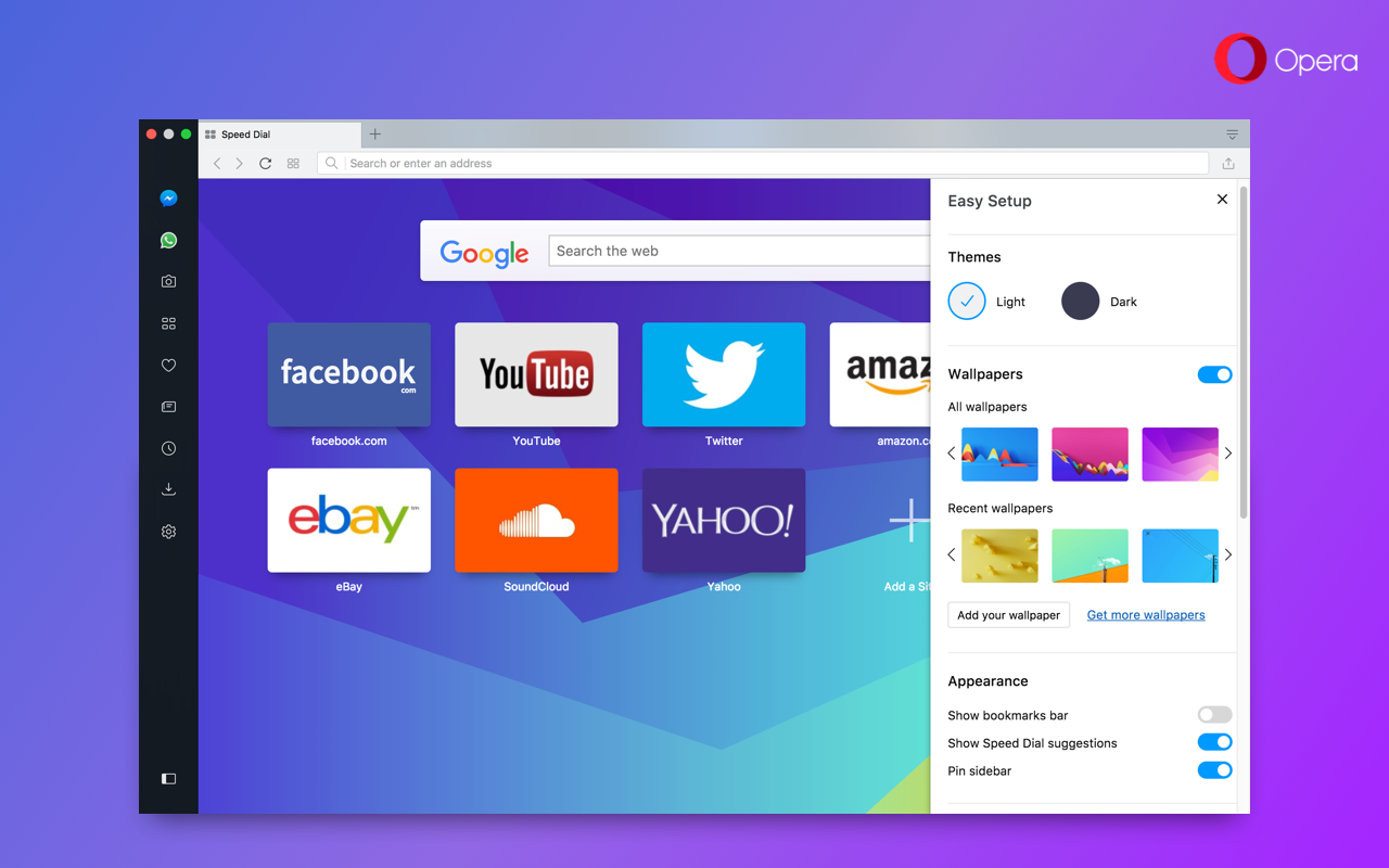
Today’s build introduces “Easy Setup”, which supersedes the previous “Customize Start Page”. It is not only a refreshed and redesigned view, but it also provides access to a handy, all-in-one setup panel for new or seasoned users to configure Opera’s features.
There are also switches that help customize the way Opera looks including themes, wallpapers, whether sidebar is pinned, etc. In addition, the most commonly accessed and modified settings are included. As in the previous version, at the very end, you will find a link to full settings.

It’s worth mentioning that some of the configurations from “Customize Start Page” are moved into Settings (Preferences on macOS) -> Browser -> Start page section. Items in the sidebar can be altered with context menu.
O-menu history improvements
Recently, we reorganized the O-menu to make it cleaner and more contextual. We also added list of recently closed tabs and windows in History menu item. Today’s build improves the way that list works.
The most notable change is that it is global. No matter from which window you will access the menu, it will contain the same list of tabs. This is especially useful when you know that you have closed a tab but can’t remember from which window.
Closed windows are now easier to spot. Closing the entire window with multiple – or even only one – tabs open will place all tabs as a single entry in the recently closed tabs page. For example, if you terminate 20 tabs, you can later reopen them all under “20 Tabs – Window”.

Refined private mode
Some months ago, we introduced to Opera a dark theme. Thanks to user feedback, we have improved the overall appearance of the browser in dark theme. We have now decided to adjusting the lighting for private browsing mode.
Our original appearance for private browsing was a bit harsh to our users’ eyes because of the very dark background color contrasting against the light tabs. Now, private mode appears more like light theme mode with an appropriately matched dark address bar. We feel this alteration is enough to signify you are now browsing in private mode (think that your URLs are hiding from trackers in the darkness of the address bar), and it should be easier on your eyes, as well.
Also, we changed the private browsing icon. The previous one, introduced in Opera Reborn, mistakenly suggested a reading mode had been activated. A faceless man with glasses and a hat will now welcome you to your private browsing session.

New private mode is available on Windows and Linux.
Also, we fixed some annoying issues such as Netflix not streaming our favorite shows and we introduced a couple of changes related to HiDPI screens. Here’s the highlight list:
- Fixed issue with Netflix not playing videos.
- Fixed crash when closing private window while websites are loading through VPN.
- [Mac High Sierra] Fixed wrong tab position after drag and drop.
- [Win] Render battery icon correctly when window is not maximized.
- [HiDPI] Fix for attaching tab to window.
- [HiDPI] Extension icons should be sharper.
- [Win][HiDPI] Horizontal lines in menus should be sharper.
- [Win][HiDPI] Search engine icons are sharper.
- [Win7][HiDPI] Checkboxes are sharper.
- [Win7][HiDPI] Fix for screen flashing when drag tab.
Chromium updated to 62.0.3188.4.
Check the changelog for the full report.
Installation links:
-
- Opera developer for Windows (Using Opera developer for Windows installer means Opera for Computers EULA is accepted)
- Opera developer for Windows (Portable version)
- Opera developer for macOS
- Opera developer for Linux – deb packages
- Opera developer for Linux – RPM packages


