Opera Touch comes with cookie dialog blocker and 23 other improvements


Hello there,
Today we are happy to announce that Opera Touch now allows you to block annoying cookie dialogs – both on Android and iOS. We would also like to shed some light on the 23 other major improvements we’ve made to our browser based on your feedback since its launch.
Opera Touch blocks annoying cookie dialogs and lets you focus on browsing
The recent introduction of the General Data Protection Regulation (GDPR) was intended to provide people with improved control over their online privacy. However, an unforeseen consequence has been a sharp increase in often complex and confusing attempts from websites to make their visitors agree to their privacy practices and policies.
We first released this feature in our Opera for Android browser, and since its reception was overwhelmingly positive, we decided to also put it into Opera Touch – both on Android and iOS. As one user put it, “This is a feature that nobody was asking for but everybody needs.”
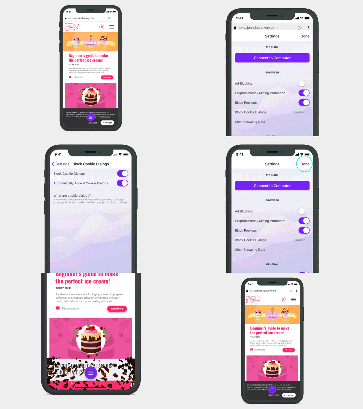
This makes Opera the first major browser to allow people to choose whether they want to see those annoying cookie dialogs or not.
Cleaner web browsing with cookie dialog blocker
Enabling the cookie dialog blocker removes the cookie alert dialogs that may appear as you browse. This means your daily browsing with Touch will become cleaner and neater. We simply want you to be able to focus on the content you are interested in, not on tapping through numerous prompts before you can even access a website.
The cookie dialog blocker in Opera will allow users to block dialog attempts using a combination of CSS rules and JavaScript heuristics. The feature has been tested on more than 15,000 of the most popular websites. The feature is under continuous development so we will add support for more in the near future.
24 improvements to Opera Touch since launch
Now let’s talk about progress, an idea we pride ourselves on at Opera. Like all things, it’s been a process, but we’ve introduced 24 major updates since the initial launch of Opera Touch for Android in April 2018 and for iOS in October 2018.
Your suggestions are what inspire us and help shape Opera Touch. Put plain and simple: we love to hear your opinions on how we can make browsing easier for you.
Opera Touch is a fast, lightweight browser which has won the Red Dot Communication Design Award for its unique user interface design. It also seamlessly pairs with the Opera desktop browser through the My Flow feature.
List of key changes
Here’s a highlight of the changes that we’ve introduced.
1. Connect more devices to My Flow
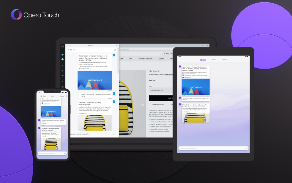
Add more computers, tablets and phones to your My Flow to share notes, links and images between them.
2. Private Mode
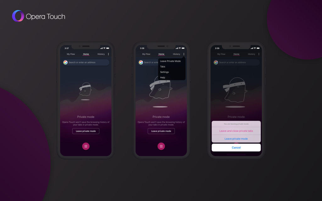
Because sometimes you want to keep your browsing under the radar. Private mode, also known as incognito mode, is a feature that creates a separate session for browsing, one that doesn’t appear in your browser’s history. In addition, all data stored during that session – cookies, for example – are wiped out.
3. Dark Theme
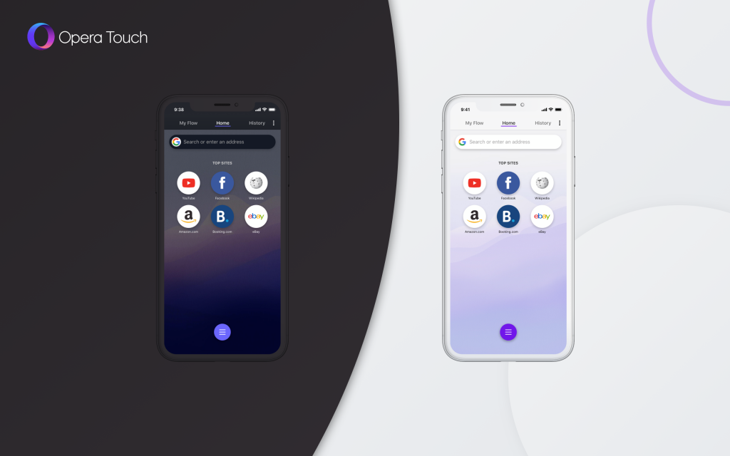
Some users prefer to browse the web using a dark theme. It’s a personal preference and we are giving you the choice.
4. Cookie dialog blocker
We’re giving you the possibility to block annoying cookie prompts so you can enjoy a better browsing experience.

5. Configurable search engines
You can now choose from a diverse selection of 11 search engines including Google, Yahoo, DuckDuckGo, Qwant and others.
6. iPad support
We have optimized the UI for iPad. You now have the option to move the Fast Action Button (FAB) so it stays within your thumb’s reach.
7. Starred pages on your home screen
Pin your favorite pages and keep them close.
8. Find in Page
It’s a small but very convenient function which allows you to search for key identifying words or phrases on a page.
9. Page translation
So that you’re sure you got that information right, in any language.
10. Search available in the context menu
Highlight a word on a page simply by tapping it and holding it down. This options lets you perform a search based on the highlighted word instead of cumbersome copy-pasting.
11. Ad blocker improvements
Our ad blocker is now better at blocking annoyances on the web.
12. Easier way to open a tab in the background/ foreground
We have introduced an easier way to view and cycle through tabs by adding a foreground list of tabs while still retaining the cycling feature in the background.
13. Ability to download images and search Google for an image
You now have a direct download option while accessing toggleable images, as well as being able to search solely for Google images.
14. Request the desktop version of a page
Annoyed by websites automatically switching to mobile versions? Choose between desktop or mobile site-view.
15. Clear history from the 3-dot menu
You now have faster access to history cleanup.
16. Add pages to the system’s home screen on Android
Some pages deserve to be right on your phone’s home screen. Now you can add pages to your system’s home screen on Android by simply going to the three-dot menu and tapping Add To Home Screen.
17. Fast Action Button (FAB) available in tab view
18. Improvements to the Fast Action Button (FAB)
Multiple tweaks and improvements were made to the way in which the FAB works. The tab preview is the most visible one, making switching between tabs more efficient.
19. Autocomplete arrow in search suggestions
Tap preemptive search suggestions so you can finish your query faster with less typing.
20. Back button improvements
We’ve listened to your suggestions on ways to make the back button better, so we are now introducing a new version.
21. Improvements to the initial user experience, navigation and configuration
22. Visual improvements
Functions and options are ascribed to utility, but Opera Touch should also be visually poignant, allowing users to have linear continuity in terms of aesthetic design. To do this, we’ve added nicer animations along with better screen transitions and refined graphics.
23. Stability and performance improvements
This is not a feature, but an equally important aspect which we maintain. Cleaner programming allows for a better user experience; we’ve also mitigated bug issues and improved reliability.
24. Reduced package size
Finally, we’ve reduced the download size of the package so it’s more manageable for those with storage issues, reflecting the lightweight nature of our browser.
Red Dot in Communication Design Award
On another note, we have further proof that Opera Touch, one of the smallest and fastest browsers around, is also the best designed one. We won the Red Dot in Communication Design award back in October and soon we’ll share some more news about a further award we’ve secured.

Become a beta tester to stay ahead of others
Our wheels are ever-turning and there’s still much more to come! However, you shouldn’t feel left out. To get the latest app builds before they become official, you can partake in our BETA channels. We are looking forward to your feedback! Opera Touch BETA for Android, Opera Touch BETA for iOS.
Download Opera Touch now


