Getting the O right: The visual process behind Opera’s rebranding

This week, we rolled out the new “O” in Opera for computers. You can also see it in Opera Mini for Windows Phone, Opera Mini for iOS and soon on our other apps, as we gradually update them.
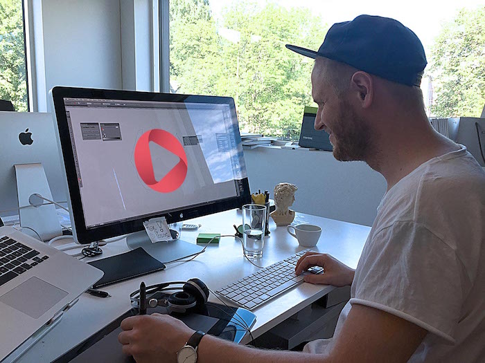
We revealed the rebranded Opera after a challenging 17-month process that involved a lot of experimentations. I’m Arnfinn, and I lead Opera’s creative team. Today, I’ll tell you the visual process of how we rebranded Opera.
The new logo is still a red “O”
We understood we could not really move too far away from it. It’s about trust and continuity.
We know that millions of people are clicking the “O” every day. If we changed to something completely different, then people would not recognize it. If people could not find it on their phone, then they might just move on to the next browser.
We really did try out different logos, though. All kinds of crazy stuff. When we made a logo that looked like a cocktail, we knew we’d probably done all the experimenting we needed to do.
But, of course, this process of trying out all kinds of different things is the only way to find what suits you best.
The “aha” moment
As we were doing our experimentations, we kept waiting for the “this is it” moment, but we did not land on it until we hit upon the portal idea, that the “O” is your portal to the internet. It just made sense. We talked to the different Opera product teams and the executive team. They got the concept right away and gave us the green light.
The visual change may be more an evolution of style, but it’s a revolution in what it conveys.

It all fell into place, and we created what most of our followers on social media call “the ring”.
Working with Anti and DixonBaxi
We also went through a rebranding strategy phase. We reviewed the scope of Opera’s contribution to the internet today. It was clear we needed a new look to fit the reality of where Opera is now.
After the strategy phase, we chose external teams we trust and respect to work with. DixonBaxi is a London-based creative agency that helped us develop our brand strategy. Anti is a Norwegian-based creative agency that helped us on the visual side of the rebranding.
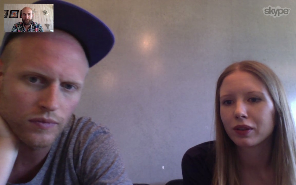
Working from my cabin and talking to the Anti team in my Hawaiian shirt. I though I would have a day by the sea, but spent it all inside.
Making the “O” work on a small screen
Sure we imagined a fantastic “O” on a billboard in Times Square, but the reality is that we need to make a logo that looked just as impressive on an Android device in Dhaka.
That’s why we teamed up with Iconfactory who are pixel perfectionists. Jon Hicks had worked with them before and said good things. Working with Anthony and Travis from Iconfactory was a pleasure.
Opera for computers design lead Jon Hicks, mobile design lead Stefan Stjernelund and me collaborating with Iconfactory.
Brand consistency for different apps
For a company like Opera, rebranding can be tricky. We needed to make sure the logo would work across our different products like Opera Coast and Opera Max. We wanted also to create a look for sub brands, so you can clearly, quickly see they’re part of the Opera family of apps.
It’s been a hard nut to crack, but we think we’ve achieved logos that visually build on the Opera brand.
The “brand device”
The stuff that goes into the “O” and what comes out is what we call the “brand device”.
The mesh is a metaphor for the technology that is at the core of our products. Our compression technology, speed and other features are represented in this technical mesh.
On the other side, we have the experience part, the part that’s about the emotions and what our technology enables. It’s represented by the red-velvet fabric – something nice to the touch and very versatile. We want to use this imagery in all our communications, to create a link to Opera whenever you see it.
That’s the idea anyway.
Release cycles: Dev, beta, stable
We want to use the portal thinking everywhere, so it was only natural to also introduce it in our product release cycles. It is visually clear in Opera for computers, which has three streams — developer, beta and stable.
The developer icon will have the mesh, what represents our tech as the building blocks. Beta is almost done so it will have a touch of red, while the stable, completely red logo represents it all coming together.
![]()
A/B testing
We needed to know that this new identity would work so we tested it. A lot.
We did user tests, A/B tests on opera.com, advertising tests and also testing in Google Play. We just had to know that people would recognize the new logo. And, we were happy when this was confirmed.
It’s been one heck of a project, the biggest one I have ever worked on, as well as the most rewarding and frustrating. In the end, though, I can see that all our hard work has been worth it.
You can also get the Opera brand as wallpaper for your device.

Download it for your computer | Download it for your phone


