Opera has a new logo and brand identity

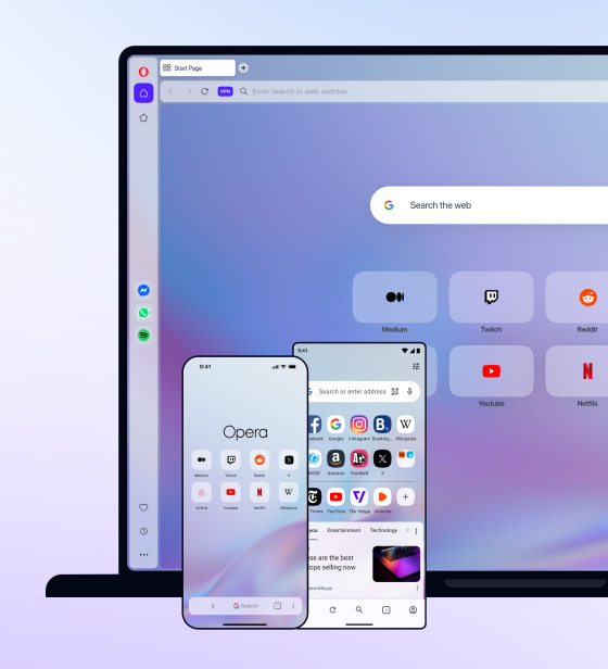
Today, we introduced Opera’s new brand identity.
It’s not just about revealing a new logo. We want to show our users how we’ve moved from getting them online to letting them do more on the web.
The “O” is no longer just the first letter of our name. It’s the gateway to a world of more, a portal that connects over 350 million people to the power of the internet.
We’ve grown beyond the boundaries of a browser company, extending our portfolio of products and services. And, to reflect this, we’ve redesigned and modernized our logo. You can read more about Opera’s re-branding in this blog by Sean D’Arcy, VP Global Marketing and Distribution at Opera.
In the comments section below, drop in your thoughts about the new logo.


