Opera 65 comes with an improved tracker blocker and redesigned address bar

Opera 65 is here. The new version of the browser comes with an improved tracker blocker, a redesigned address bar, and a new look for bookmarks and history.

Hello everyone,
Today we are very happy to introduce a brand-new version of our desktop browser, Opera 65. It includes an important update to our tracker blocker which lets you see the trackers Opera is blocking, as well as design changes in the address bar and updates to the bookmarks and history sections.
See which trackers you are blocking
Throughout a day of web browsing, you typically stumble across hundreds of trackers which gather information and track your online behavior while remaining invisible to you. Some of the traces you leave are good for you, tailoring websites to your needs, but there is also a lot of tracking taking place online that you might not be aware of. Opera now makes these trackers visible to you.
With the newest version of our browser, we are giving you more control. The tracker blocker feature, which we introduced in Opera 64, can be switched on in the Easy setup menu or in your browser’s settings. Once you’ve switched it on, a shield icon appears in the address bar where you can easily see the number of trackers being blocked, as well as a list of said trackers. The feature can be toggled on and off for individual sites.
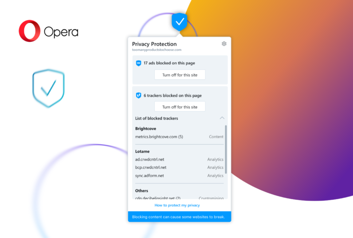
The tracker blocker relies on the EasyPrivacy Tracking Protection List. Similar to Opera’s native ad blocker, it has a list of known tracker scripts and blocks them. Once switched on, the tracker blocker can speed up page loading by roughly 20 percent. It also increases your level of privacy. Coupled with our built-in ad blocker, the speed gain can reach up to 76 percent.
A redesigned address bar
With the release of Opera Reborn 3 last spring, we introduced a redesigned interface with features including a light and dark theme, allowing you to adjust your browser to your mood and help you focus on browsing. Today we are continuing the R3 design changes with a new, improved version of the address bar.

When using the address bar, the webpage that is currently being used is dimmed, providing visual clarity while searching. The dropdown layout has also changed – website titles are now displayed first, followed by hyperlinks, providing a cleaner overview of browsing-history suggestions, bookmarks and Speed Dial elements. This change relates to the way we scan content – looking at titles not links, reading from left to right. Websites also now appear with their website logo, making them more distinguishable, and you can quickly access any previously visited website by typing in a keyword. All of these changes allow for easier access to content as well as a faster browsing experience.
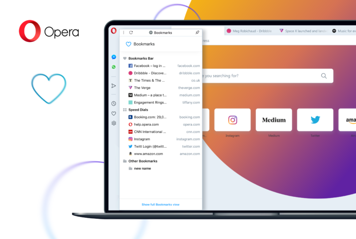
Bookmarks in the sidebar panel
We have also been busy working on a brand-new look and layout for bookmarks. Based on your suggestions, we have changed their appearance in a way that, we believe, makes them more accessible and useful when browsing.
A click on the heart icon in the sidebar opens the new bookmarks panel. In this sidebar panel view, you can easily edit or delete bookmarks and folders. The panel layout is a bit simpler than that of the Bookmarks Manager. If you’d like to have more options, you can select Show full Bookmarks view.
We hope you enjoy the newest updates. Happy browsing!
Here’s the full changelog.
Installation links:
- Opera Stable for Windows
- Opera Stable for macOS
- Opera Stable for Linux – deb packages
- Opera Stable for Linux – RPM packages


